Garden Study gets a new banner
My favorite Substack starts a new 'stack and I made the art for it.
Last week, Anne Helen Petersen put a call out on her new Substack, Garden Study, for designers that could make a banner for her. I responded and it was a good fit so we got right to work! Below is a roadmap of sorts of how I did it.
After my initial outreach, AHP responded with, “I'm wondering if you think there's a way to incorporate the words Garden Study in some way — any thoughts? We could do the words and then a small plant on either side, or anything else you might have in mind.”
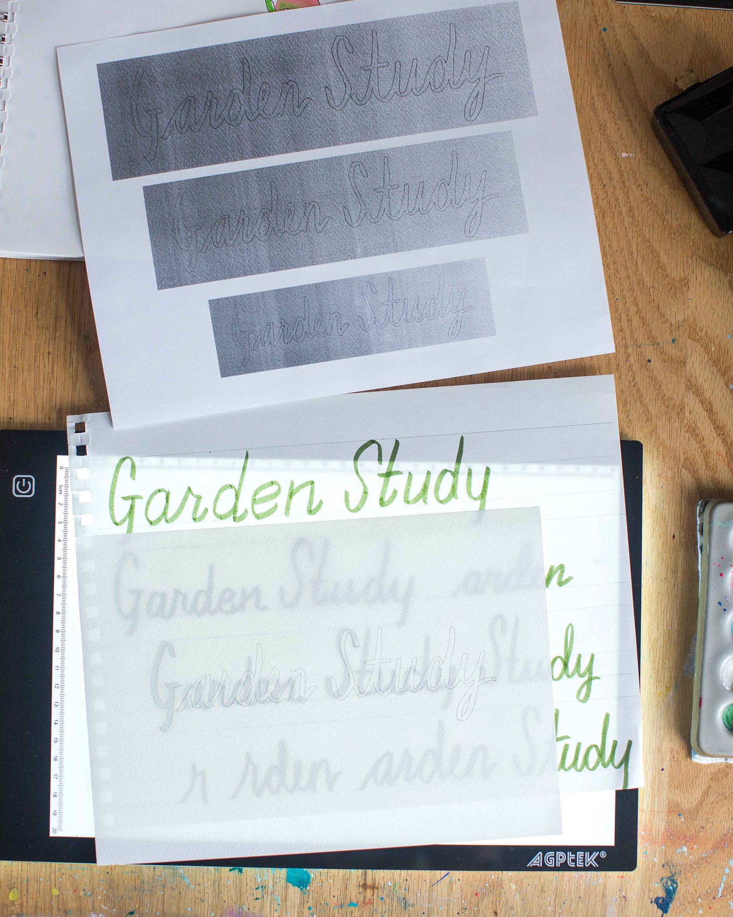
I started the whole thing by mapping out the size of email banner suggested by Substack (1100 x 220 pixels). Then I did many many drafts of the lettering. Shown above is just one of many sketchbook pages I worked on. This book was immensely helpful with lettering technique, as it’s not a strength of mine.
Next step was to decide which lettering I liked best. I never got the full word in a single take to look how I wanted, so I traced bits and pieces from different sketches until it looked the way I wanted it to. This pencil tracing was the basis for all the next steps.
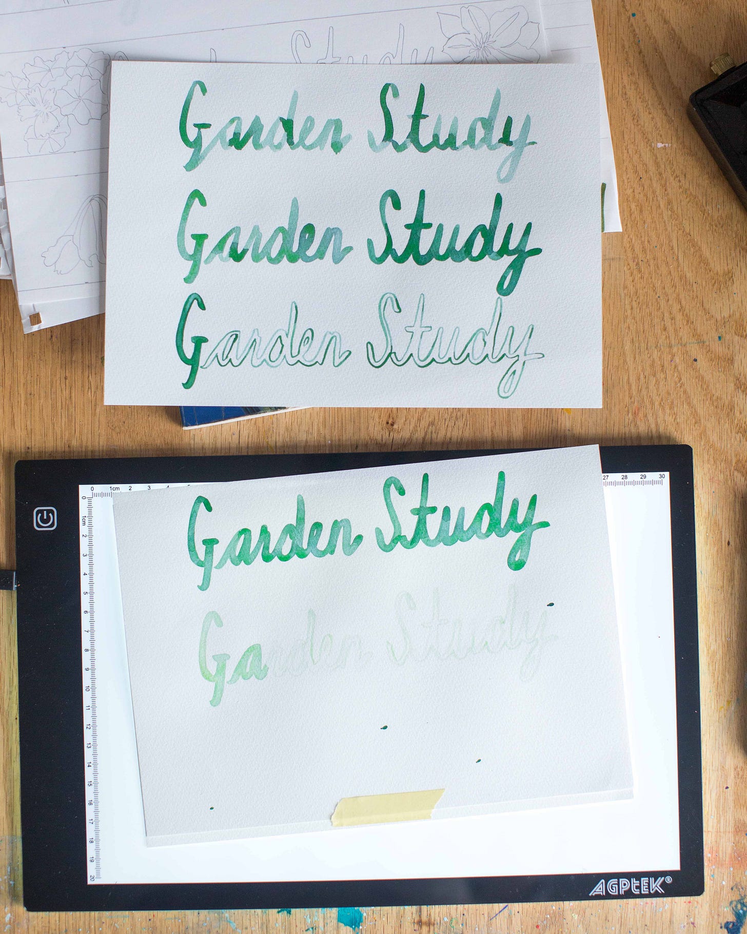
Here, I traced that pencil drawing with paint several times just to have options. Watercolor is fickle and you don’t get to decide how it’s going to flow on a page, so I did it multiple times until I was happy with the way the pigments landed.
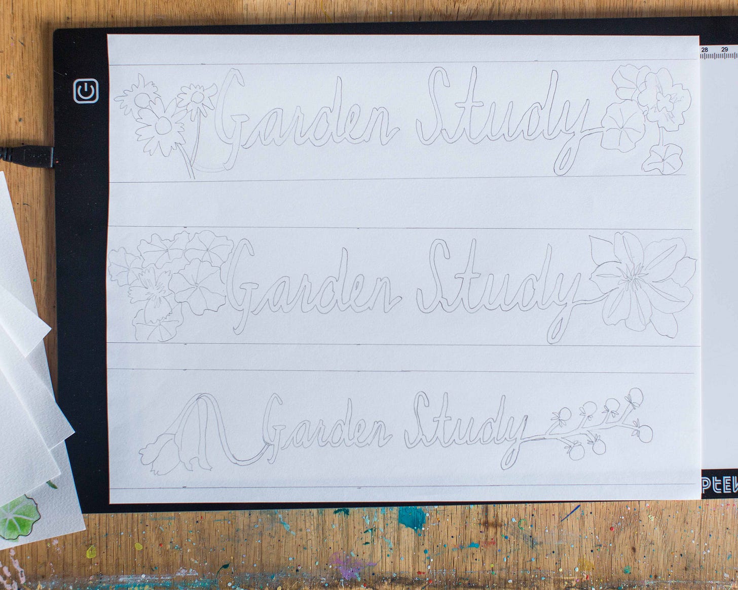
Then I worked out the scale of the lettering within the 1100 x 220 box and tested out some different plants. We liked nasturtium and clematis best (middle one), but the size of the letters in the bottom one.
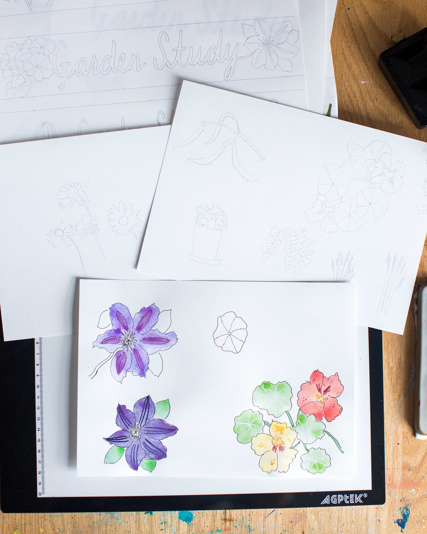
I inked and painting the flowers a couple of times. The first few warm-ups are just that, warm-ups. It took twenty to thirty minutes of drawing and painting for me to settle in, chill out and do them the way I liked.
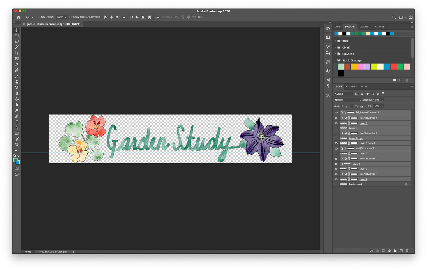
Everything got scanned and imported into Photoshop. Here, I have to color-correct the scans (my scanner does not do greens and yellows very well). I also made some size / scale adjustments and added an extension to the “y” so it forms the clematis stem.
AHP’s review, “AMAZING! This was so fun to work on together — and I'm going to use it on the Garden Study going up [Thursday]!”
An A+ project all around. Any chance to paint flowers and practice letters is a good day in my book. You should see it show up in the Garden Study emails next week :)
Supplies used
Case for Making watercolors
Brush Lettering by Jim Gray and Bobbie Gray
Light box from AGPtek
New Soho Sketch pad
Artline Pen 0.2 mm
Princeton Lauren Series round size 1 paintbrush
Epson V19 scanner
Adobe Photoshop image editing software
Subscribe to Culture Study below
If you want Garden Study follow the directions in this post
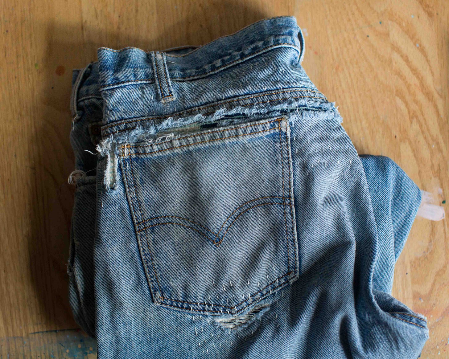
I finished another denim repair project this week. These had major damage above and around both back pockets, plus a big hole up the front. This was particularly satisfying as the jeans were unwearable before and now can be worn once again!
That’s it! See you next week.




Loved seeing the process here!
Thank you so much for this behind-the-artist (& designer) show and tell. As a writer, my process isn't as visually intriguing, but I love to glimpse creative processes by those whose art steps demonstrate the thinking and the imagination behind the final ta-da!